
Discover the Iconic Yellowstone Font That Defines a TV Phenomenon
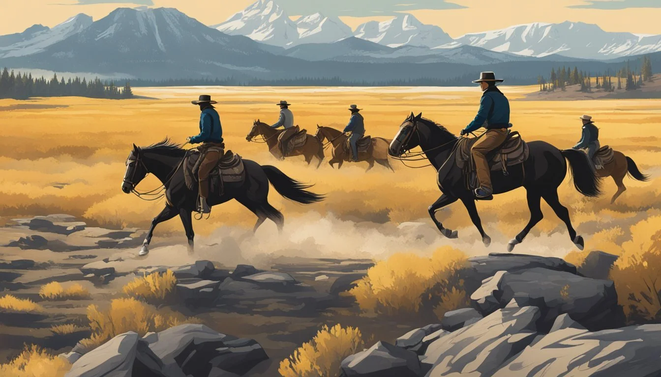
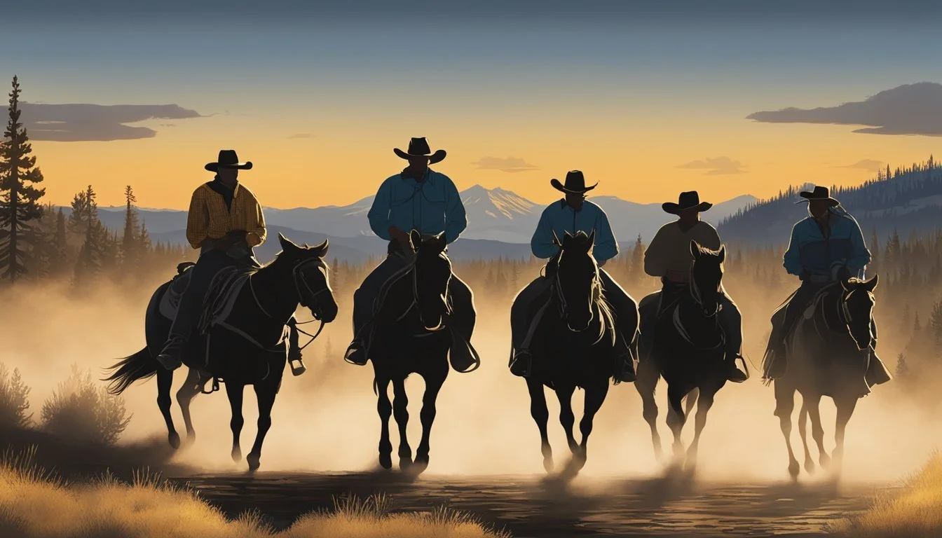
The hit TV series Yellowstone has captivated audiences with its gripping drama and stunning visuals of the American West. Starring Kevin Costner as the patriarch of the Dutton family, the show follows their struggles to maintain control of their vast ranch. The distinctive font used in the Yellowstone logo is a grunged version of Hatch, a slab serif typeface designed by Mark Caneso.
Hatch's bold, rugged aesthetic perfectly captures the show's gritty, neo-Western tone. The font's weathered appearance evokes the harsh landscape and tough characters that define Yellowstone's world. This attention to visual details, including typography, has helped establish the show's strong brand identity since its 2018 premiere on Paramount Network.
Fans of Yellowstone can now incorporate the show's iconic look into their own designs. Several websites offer font generators that allow users to create text in the style of the Yellowstone logo. This enables enthusiasts to craft custom graphics inspired by the series, further expanding its cultural impact beyond the screen.
Origins of the Yellowstone Show Font
The Yellowstone show font emerged from careful design choices to establish a distinctive visual identity. Its creation involved typography experts and branding considerations specific to the neo-Western drama series.
Typography and Brand Identity
The Yellowstone logo utilizes a slab-serif font called Hatch. This typeface aligns with the show's rugged, Western aesthetic while maintaining a modern edge. Slab-serif fonts feature thick, block-like serifs that convey strength and stability - qualities that resonate with the show's themes.
Hatch's bold letterforms create a striking visual impact, enhancing brand recognition across promotional materials. The all-caps presentation further reinforces the sense of power and authority associated with the Dutton family ranch.
Mark Caneso and PSType
Mark Caneso, founder of the type foundry PSType, designed the Hatch font in 2012. PSType specializes in creating unique, high-quality typefaces for various applications. Caneso's work on Hatch predates Yellowstone's 2018 premiere, but the font's characteristics made it an ideal choice for the show's branding.
The selection of Hatch demonstrates the importance of font licensing in television production. Yellowstone's creators obtained proper permissions through Adobe Fonts to use this distinctive typeface in their marketing and on-screen graphics.
Visual Characteristics

The Yellowstone font embodies a rugged yet refined aesthetic that captures the essence of the American West. Its distinctive visual elements contribute to the show's branding and overall atmosphere.
The Role of Slab Serif
Slab serif typefaces play a crucial role in the Yellowstone font's visual impact. These bold, blocky serifs add weight and stability to the letterforms, evoking a sense of strength and durability. The slab serifs also enhance legibility, especially at larger sizes, making the font ideal for titles and headers.
The typeface's strong horizontal lines and squared-off terminals reinforce the frontier spirit of the show. This design choice creates a visual connection to weathered wooden signs and old-fashioned printing techniques, subtly reinforcing the series' themes of tradition and resilience.
Font Weights and Variations
The Yellowstone font family offers multiple weights and variations to suit different design needs. The primary logo uses a bold weight that commands attention and stands out against diverse backgrounds. Lighter weights are available for supporting text and secondary branding elements.
Bold: Used for main titles and logos
Medium: Suitable for subtitles and headings
Regular: Ideal for body text and smaller applications
This range of weights allows designers to create a cohesive visual hierarchy across various marketing materials and show graphics.
Glyphs and Customization
The Yellowstone font features a set of carefully crafted glyphs that contribute to its unique character. Custom letterforms, such as the distinctive "Y" and "W", add personality and recognition to the typeface. These bespoke elements make the font instantly identifiable and difficult to replicate.
Typographic details like slightly condensed proportions and subtle variations in stroke weight add visual interest and improve readability. The font also includes specialized glyphs for numerals and punctuation, ensuring consistency across all applications.
Designers can further customize the font by adjusting kerning and letter spacing to achieve the perfect balance for specific uses, from large-scale outdoor advertising to intricate on-screen graphics.
Cultural Impact and Usage
The Yellowstone font has become synonymous with the rugged, neo-Western aesthetic popularized by the hit TV series. Its distinctive style has influenced both the entertainment industry and consumer products.
Influence on Neo-Western Drama
The Yellowstone font has set a visual standard for neo-Western dramas. Its bold, weathered appearance captures the essence of the modern frontier depicted in the show. Other productions have adopted similar typefaces to evoke a sense of grit and authenticity.
This typographic choice reinforces the genre's themes of tradition clashing with progress. The font's rough edges mirror the complex characters navigating moral gray areas in these narratives.
Adoption in Merchandise and Media
Yellowstone's logo font has found widespread use in official merchandise. T-shirts, hats, and posters feature the iconic lettering, allowing fans to display their affinity for the show.
The font's commercial appeal extends beyond direct tie-ins. Western-themed restaurants, dude ranches, and outdoor gear companies have embraced similar typefaces to tap into the Yellowstone aesthetic.
This typographic trend has even influenced unrelated industries. Some brands use rugged fonts to convey durability or an adventurous spirit, capitalizing on Yellowstone's cultural cachet.
Technical Aspects and Accessibility
Font generators and licensing considerations are key elements when working with the Yellowstone show font. These tools enable creative applications while legal aspects ensure proper usage rights.
Font Generators and Tools
Font generators offer convenient ways to recreate the Yellowstone logo style. Several online tools provide real-time previews, allowing users to experiment with custom text. These generators typically offer various stylistic options to match the show's aesthetic.
Some tools focus specifically on the Yellowstone font, while others offer broader customization. Users can adjust parameters like size, color, and effects to achieve desired results. Many generators allow for easy download of the created designs as image files.
Licensing and Usage Rights
The Yellowstone show font, identified as Hatch, requires proper licensing for commercial use. Personal projects may have different requirements. It's crucial to review the specific terms associated with the font.
Commercial licenses often involve fees and may have restrictions on distribution or modification. Personal use licenses are generally more permissive but still have limitations. Users should carefully read the licensing agreement before applying the font in any project.
Some font generators may offer alternative fonts with similar styles that have more flexible licensing terms. This can be a useful option for those seeking a comparable look without complex licensing obligations.
Relevance to Yellowstone Ranch Narrative

The Yellowstone font embodies the rugged spirit and high-stakes conflicts at the heart of the show's plot. Its bold, imposing letterforms mirror the power struggles between the Dutton family and their adversaries.
Associations with Power and Land Developers
The Hatch font used in Yellowstone's title sequence conveys strength and dominance, reflecting the Dutton family's determination to maintain control of their vast ranch. Its sharp edges and sturdy construction evoke the harsh realities of ranching life and the cutthroat world of land development.
The font's design draws parallels to old ranch signage, connecting it to the show's Western setting. This visual link reinforces the central conflict between tradition and progress, as embodied by the Duttons and encroaching developers.
In promotional materials, the all-caps styling of the font further emphasizes themes of power and authority. This typographic choice aligns with the show's portrayal of the largest contiguous ranch in the United States and the influence it wields.
The font's rugged aesthetic also represents the untamed nature of the Yellowstone landscape, serving as a constant reminder of the valuable land at stake in the series' ongoing conflicts.