
6 Innovative Ways to Use Color Grading to Enhance Your Film's Mood
Mastering Visual Storytelling
Color grading is a powerful tool in filmmaking that can significantly impact the emotional tone and visual appeal of a film. By precisely adjusting aspects such as color, contrast, saturation, and brightness, filmmakers can manipulate the mood and atmosphere of their project to convey specific emotions and enhance the storytelling experience.
Understanding how to utilize color grading can transform a film from ordinary to exceptional, providing viewers with a more immersive and engaging experience. This article explores six innovative techniques that filmmakers can employ to leverage color grading effectively, making their films more impactful and visually compelling.
1) Use Contrasting Colors to Highlight Emotional Shifts

Contrasting colors are powerful tools in color grading, allowing filmmakers to accentuate emotional transitions. High contrast between colors can make a scene more dynamic, drawing viewers’ attention to significant shifts in mood or tone.
For instance, a sudden change from warm hues to cool hues can signify a shift from a comforting atmosphere to a tense one. This technique helps convey the psychological state of characters, enhancing the audience's emotional experience.
Using contrasting colors can also serve to differentiate between narrative elements. For example, scenes of reality might be depicted in muted tones, while flashbacks use more vibrant colors.
Color grading with contrasting colors requires careful planning. Filmmakers must consider which emotions they want to evoke and choose color pairings that effectively communicate those feelings.
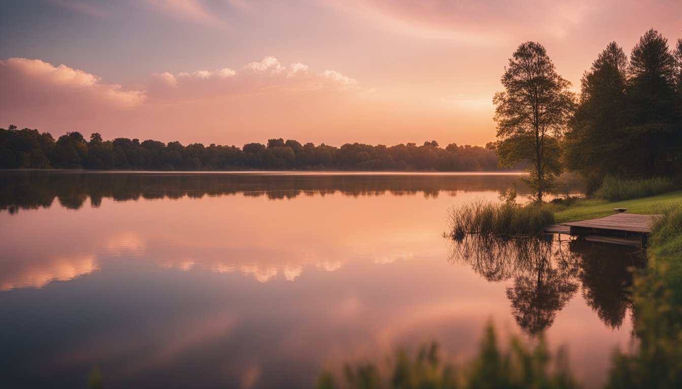
2) Apply Warm Color Temps for Nostalgic Scenes
Warm color temperatures can evoke memories and trigger feelings of nostalgia. By increasing the warmth in the color palette, filmmakers can transport audiences to a bygone era or evoke a sense of sentimental longing.
Golden hues and soft oranges are ideal for creating a nostalgic atmosphere. These colors often mimic the look of old photographs or the golden hour in natural lighting.
When adjusting the color temperature, subtlety is key. Overdoing the warm tones can make the scene feel unnatural. Aim for a balanced warmth that enhances the emotive quality of the scene without overwhelming it.
Pair warm color temperatures with soft focus to further enhance the nostalgic effect. The combination can lend an almost dreamlike quality to the footage.
Incorporating warm tones can also help to highlight emotional moments within a scene, making them more impactful and memorable. This technique is especially effective in flashbacks or scenes meant to evoke past memories.
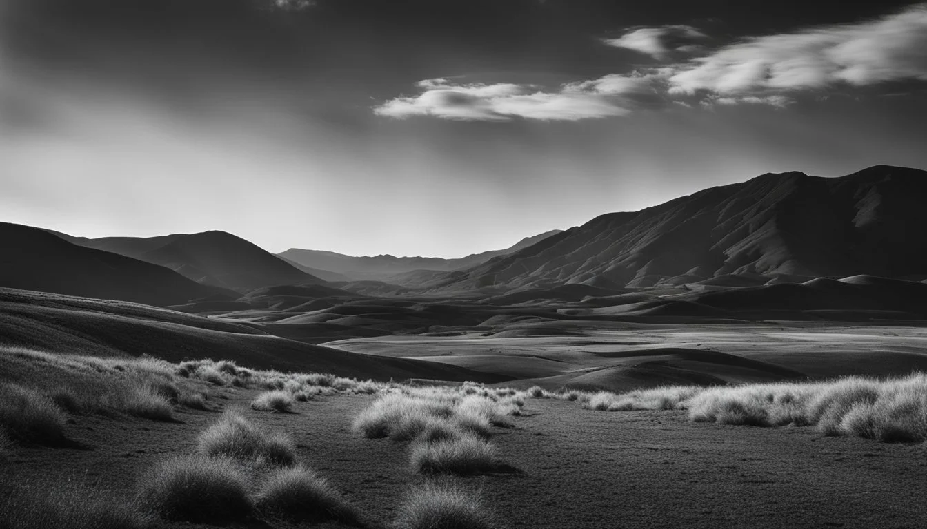
3) Employ Cooler Tones for Suspenseful Moments
Using cooler tones like blue, green, and cyan can effectively heighten suspense in a film. These colors often evoke feelings of unease, tension, and detachment, making them ideal for building a mysterious or suspenseful atmosphere.
In scenes where characters face unknown threats or are in precarious situations, cooler tones can amplify their sense of vulnerability. The coldness of these hues can mirror the emotional chill the audience is meant to feel.
Films like The Matrix utilize green hues to create an unsettling, otherworldly effect. Similarly, blue tones are frequently used in horror and thriller genres to convey a foreboding environment.
During night scenes or in settings like dimly lit corridors, employing cooler tones can make the surroundings appear more menacing. This technique can keep viewers on edge, anticipating the next twist or danger.
Adjusting the color grading towards cooler tones helps signal to the audience that they are entering a phase of increased tension. This subtle visual cue can be more effective than dramatic musical scores or overt narrative hints.
4) Combine Monochromatic Schemes for Dramatic Effect
Combining monochromatic schemes can significantly enhance the drama in your film. Using different shades and tints of a single color can create depth and interest without overwhelming the viewer.
Consider a scene in varying shades of blue. Deep navy can evoke sadness or tension, while lighter sky blues can introduce calmness. This contrast within a single color can heighten emotional impact.
Another example could involve using shades of green. Dark emerald adds a sense of mystery or intrigue, while mint hues can offer a tranquil or refreshing feel. Mixing these can create a nuanced, layered atmosphere.
Combining monochromatic schemes allows for subtle transitions. This technique can smoothly guide the viewer’s emotional journey through the scene without abrupt changes. It offers a cohesive visual experience.
Careful use of lighting can complement these schemes. Light can accentuate the variations within the monochromatic palette, making the scene more dynamic. Experiment with how shadows and highlights affect your chosen color to add even more depth.
5) Utilize complementary colors to enhance visual tension
Directors can create visual tension by employing complementary colors in their films. Complementary colors, like red and green or blue and orange, are opposite each other on the color wheel. This opposition creates a vivid contrast, drawing the viewer's eyes and increasing tension.
These color pairs make scenes more dynamic. When used effectively, they can signify conflict or highlight crucial moments. Imagine a confrontation scene lit with blue and orange hues; the stark contrast heightens the emotional stakes.
Complementary colors are invaluable in underlining thematic elements. By using this technique, filmmakers can visually represent opposing forces, such as good versus evil, harmony versus chaos, or love versus hate. This visual metaphor adds depth to the narrative.
It is also essential to balance these colors carefully. Overuse can overwhelm the audience, so selective application is key. Strategic use of complementary colors can keep the viewers engaged without causing visual fatigue.
Complementary color schemes enhance the overall aesthetic appeal. They draw attention to characters or objects, guiding the viewer’s focus and enriching the storytelling. Employing these color contrasts effectively can transform a scene, making it memorable and impactful.
6) Introduce pastel hues for a dreamy atmosphere
Incorporating pastel hues into your film's color grading can evoke a dreamy, enchanting ambiance. Soft pinks, light blues, and gentle greens bring a touch of tranquility and innocence to your scenes. These colors work well for romantic moments, nostalgic flashbacks, or whimsical sequences.
Pastel colors can soften harsh lines and create a subtle, ethereal glow. This helps to emphasize the peaceful and serene moments in your narrative. Reducing saturation in your color grading will enhance the pastel effect, making it appear more natural and seamless.
To achieve a cohesive look, it is crucial to ensure that your lighting complements the pastel palette. Soft, diffused lighting will enhance the delicate hues and maintain the overall dreamy atmosphere you are aiming to create.
Using pastel hues can also help differentiate between different emotional tones. For example, scenes with pastel tones may feel more tender and intimate, contrasting with more vibrant or darker scenes. This technique aids in guiding the audience's emotional journey through the film.
Ultimately, pastel hues can transform your film, adding layers of emotional depth and visual appeal. Be intentional with your color choices and lighting to make the most out of this gentle and sophisticated palette.
Understanding Color Theory
Color theory in film is a crucial aspect used to enhance a narrative's mood and convey specific emotions. By examining the principles of color theory and the psychological effects of colors, filmmakers can create a more compelling visual story.
The Basics of Color Theory
Color theory involves understanding how colors interact and combine to produce desired effects. The primary colors—red, blue, and yellow—combine to create secondary colors like green, orange, and purple.
Hue, saturation, and brightness are essential elements. Hue refers to the color itself, saturation describes the intensity, and brightness indicates the lightness or darkness. Filmmakers must consider these factors to create harmony, contrast, and balance in their scenes.
Utilizing color wheels assists in choosing complementary colors, analogous colors, or triadic color schemes. Each scheme provides a different visual impact, guiding the viewer's emotional response and attention effectively.
Psychological Effects of Colors
Colors have strong psychological impacts on an audience. Red often signifies passion, danger, or urgency, evoking strong emotions. Blue, known for its calming effect, can symbolize tranquility, sadness, or coldness.
Yellow evokes warmth, happiness, or caution. It often catches the viewer's attention quickly. Green symbolizes nature, renewal, and sometimes jealousy. It's a versatile color used to convey a variety of moods.
Purple is associated with luxury, mystery, and magic, while orange often represents enthusiasm and warmth. By carefully choosing and combining colors based on their psychological effects, filmmakers can subtly influence the audience's emotional and psychological experience throughout the film.
Color Grading Techniques
Color grading can significantly impact a film's mood by manipulating warm and cool tones and utilizing contrast effectively. These techniques can set the atmosphere and enhance the narrative.
Warm vs Cool Tones
Warm tones like red, yellow, and orange often evoke feelings of warmth, comfort, and passion. These colors can be used to enhance scenes that are intimate or comforting. Cool tones, such as blue, green, and purple, generally create calmness, detachment, or tension. They are excellent for setting moody, melancholic, or thrilling atmospheres.
Manipulating these tones involves adjusting the color temperature and tint. For example, an intimate dinner scene could be enhanced with warm, amber hues, while a suspenseful night scene might benefit from cool, bluish tones.
Balancing warm and cool tones within a single frame can also highlight emotional contrasts between characters. Using color grading software, filmmakers can fine-tune these elements to align with the emotional beats of the story.
Using Contrast Effectively
Contrast in color grading refers to the difference between the light and dark areas of an image. High contrast can create dramatic, intense visuals, emphasizing shadows and highlights. This is particularly useful in genres like horror and thriller, where stark contrasts can build tension.
Low contrast makes for softer, more subdued images, perfect for genres like romance or coming-of-age stories. Adjusting contrast can also guide the viewer's attention to specific parts of the frame, enhancing narrative focus.
Filmmakers often use tools like the curves adjustment and Levels to control contrast. By increasing the difference between the lightest and darkest areas, they can make a scene more visually striking. Conversely, reducing contrast can give a dreamy, ethereal quality to a scene.
Case Studies
Examining color grading in iconic films and specific genres highlights how this technique sets the tone and enhances storytelling. From vivid hues to subtle shades, color grading significantly impacts the audience's experience.
Iconic Films and Their Color Palettes
The Grand Budapest Hotel by Wes Anderson utilizes a pastel color palette, enhancing the film's whimsical and nostalgic atmosphere. Pink and purple tones create an otherworldly vibe that amplifies the quirky narrative.
Mad Max: Fury Road employs a high-contrast color palette with an emphasis on orange and teal. This combination highlights the desolate and harsh environment, intensifying the film's chaotic and dystopian feel.
The Matrix uses a green tint to portray scenes within the Matrix itself, symbolizing the artificial, computer-generated reality. This decision distinguishes between the real and virtual worlds, aiding viewers in navigating the complex storyline.
Genre-Specific Uses of Color Grading
Horror Films often utilize desaturated colors and heavy shadows to evoke fear and tension. For example, The Conjuring incorporates a muted, almost monochromatic palette to create an eerie and unsettling atmosphere.
Romantic Comedies favor warm, saturated colors to produce a cozy and inviting ambiance. La La Land is a prime example, with its use of vibrant colors and romantic lighting to evoke feelings of joy and passion.
Science Fiction frequently uses cool, metallic tones to give a futuristic and sometimes sterile feeling. Blade Runner 2049 utilizes a mix of stark, cold blues and vivid neon lights, crafting a visually compelling and immersive world.
Successful color grading can amplify the mood and support the narrative, making it a crucial tool in filmmaking.